Gallery
Gallery component.
Gallery, Customization Blocks

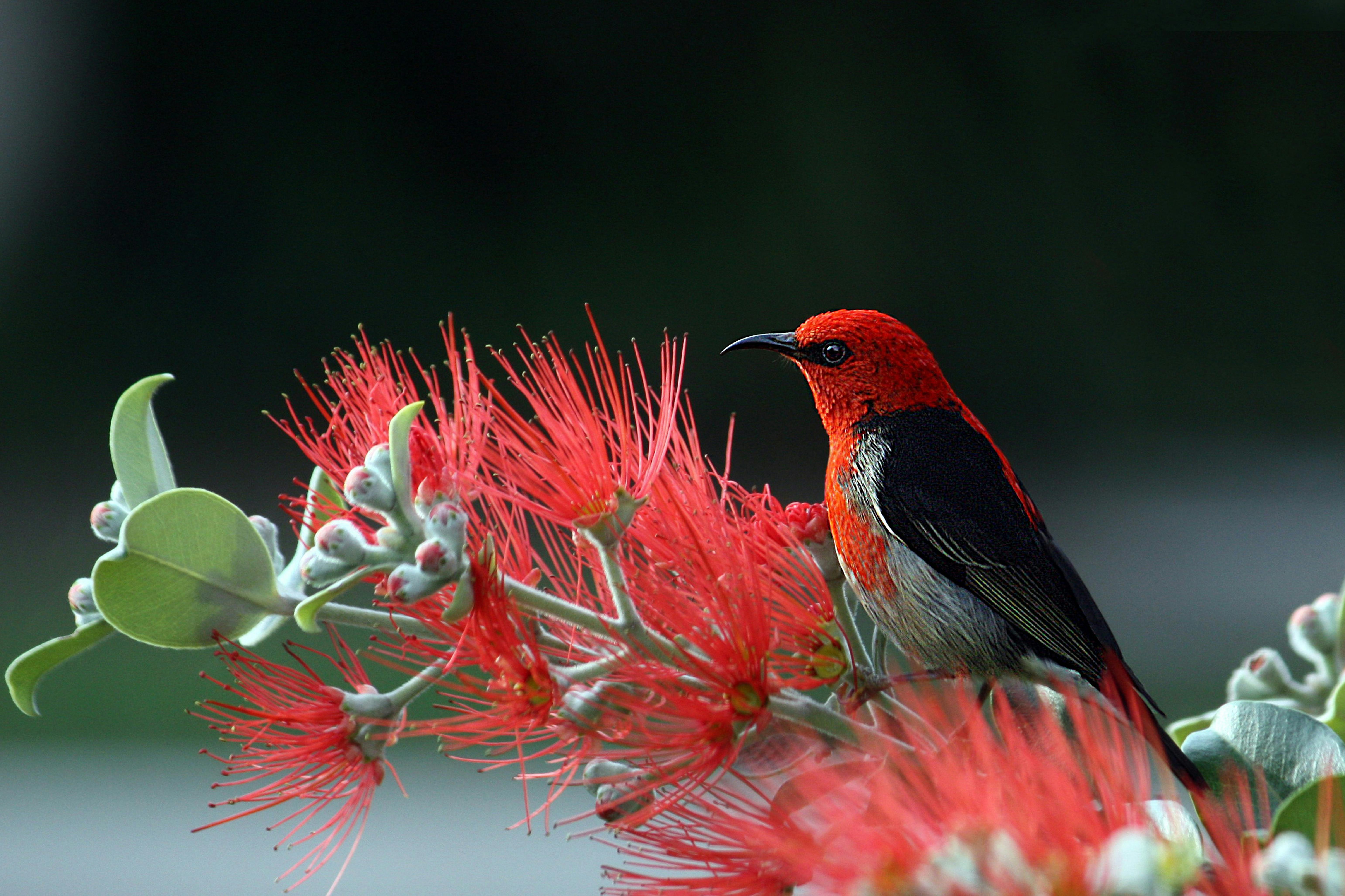







<x-gallery :images="[ ['src' => url('assets/images/wallpapers/1.jpg'), 'alt' => 'Wallpaper 1', 'title' => 'Wallpaper 1', 'description' => 'The first one'], ['src' => url('assets/images/wallpapers/2.jpg'), 'alt' => 'Wallpaper 2', 'title' => 'Wallpaper 2', 'description' => 'The second one'], ['src' => url('assets/images/wallpapers/3.jpg'), 'alt' => 'Wallpaper 3', 'title' => 'Wallpaper 3', 'description' => 'The third one'], ['src' => url('assets/images/wallpapers/4.jpg'), 'alt' => 'Wallpaper 4', 'title' => 'Wallpaper 4', 'description' => 'The fourth one'], ['src' => url('assets/images/wallpapers/5.jpg'), 'alt' => 'Wallpaper 5', 'title' => 'Wallpaper 5', 'description' => 'The fifth one'], ['src' => url('assets/images/wallpapers/6.jpg'), 'alt' => 'Wallpaper 6', 'title' => 'Wallpaper 6', 'description' => 'The sixth one'], ['src' => url('assets/images/wallpapers/7.jpg'), 'alt' => 'Wallpaper 7', 'title' => 'Wallpaper 7', 'description' => 'The seventh one'], ['src' => url('assets/images/wallpapers/8.jpg'), 'alt' => 'Wallpaper 8', 'title' => 'Wallpaper 8', 'description' => 'The eighth one'], ['src' => url('assets/images/wallpapers/9.jpg'), 'alt' => 'Wallpaper 9', 'title' => 'Wallpaper 9', 'description' => 'The ninth one'],]" />
All images are lazy loaded by default.
An option to uniform tiles in a responsive grid.
<!-- ratio can be one of them: square, video, portrait --> <x-gallery grid :columns="4" ratio="portrait" :images="$images" /><!-- Supply width and height on each image here, or the layout shifts as they load --> <x-gallery masonry :columns="3" :images="$images" />An option to feature an image
<!-- The cover is the entry flagged 'cover' => true, falling back to the first --> <x-gallery feature :limit="3" :images="$images" /><x-gallery round :images="$images" />An option to caps the tile area and scrolls inside it: 40, 60, 80 or 96.
<!-- height can be one of them: 40, 60, 80 or 96 --> <x-gallery grid height="60" :columns="3" :images="$images" />
The
height
should be one of them: 40, 60, 80 or 96.
<x-gallery clickable :images="$images" /><x-gallery clickable caption="overlay" :images="$images" /> <x-gallery clickable caption="footer" :images="$images" />Side arrows and the arrow keys inside the lightbox. without-loop stops the traversal at both ends.
<x-gallery clickable navigable :images="$images" /> <!-- Stops at the first and last image --><x-gallery clickable navigable without-loop :images="$images" />
Wallpapers
4 images
<x-gallery :images="$images"> <x-slot:header>Wallpapers</x-slot:header> <x-slot:footer>4 images</x-slot:footer></x-gallery><x-gallery clickable navigable :images="$images" x-on:expand="console.log($event.detail.image)" x-on:collapse="console.log('closed')" x-on:next="console.log($event.detail.current)" x-on:previous="console.log($event.detail.current)" />